Iconic photos can bring history, memory, and strong mood to a room. When they share a wall with posters, the result feels layered instead of flat. The trick is to guide the eye, not crowd it.
A balanced gallery wall depends on theme, spacing, and a calm frame plan. Good editing matters more than buying more pieces. That keeps the display personal and clear.
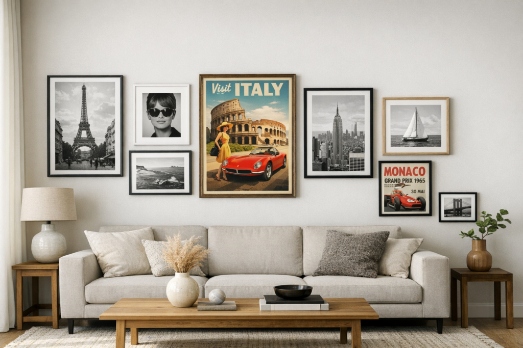
Make the whole wall feel connected
Mixing eras works best when one idea runs through the full arrangement. That idea might be a subject, a color family, or a mood. Once that thread is clear, the wall feels collected instead of random.
Let iconic photos set tone
One repeated subject can unite very different objects. An Architectural Digest home tour paired mushroom charts, scientific prints in thin wood frames, Quimper plates, family snapshots, and early 1900s paper frames. Because nature kept returning, the busy wall still felt calm.
That same approach works when iconic posters join older portraits or travel images. Many retailers sort prints by subject or style, and famous and iconic posters from Posterstore often suit a steady theme. Options now range from vintage art and movie posters to figurative pieces and documented editions. Some sellers even bundle frames, which saves time when the wall mixes eras.
Repeat one subject, such as music, travel, or nature, across old and new pieces. Echo one color in several works so the wall feels linked. Mix photos, posters, and small objects only if the same mood runs through them. Pick one thread before picking frames. That choice keeps every later decision easier.
Give iconic photos more space
House Beautiful has noted that cleaner gallery walls come from fewer, stronger choices. Each piece should earn its place, and a fixed grid can feel stiff; see this gallery wall guide for practical layout ideas. Leave some wall blank, and keep about 2 to 6 inches between works.
Mats can do as much work as frames. Architectural Digest highlighted striped, monochrome, and off center mats because they add depth and give the eye a place to rest. They can also turn same size photos or posters into a calm color series.
Use wider gaps around larger works so they do not swallow smaller neighbors. Keep outer frames calm when mat colors or shapes become more playful. Remove one piece if the eye keeps jumping instead of resting. Empty space is part of the design, not wasted room. It lets iconic photos hold attention.
Keep frames steady, not identical
Frame styles do not all need to match. Thin wood frames can sit beside darker ones if the wall repeats one finish, one mat color, or one subject. That balance lets iconic posters keep character without pulling the wall apart.
Test the arrangement on the floor before hanging anything. If one print looks loud, remove it rather than filling every gap. A gallery wall feels stronger when every piece justifies its spot.
Quick questions before you hang
Can photos and posters share one wall? Yes, photos and posters can share one wall. Color, subject, or spacing can link them. Should every frame match? No, every frame should not match, because repeated mats or wood tones can create enough order.
Should every piece go up at once? No, every piece should not go up at once, because testing the layout first prevents crowding. Is blank wall space important? Yes, blank wall space is important, because it helps the whole display breathe. It also makes each piece matter more.
 Parisilyn Cruz has played a pivotal role as an article writer and key contributor in the development of Innov Art Foundry. Her deep passion for the art world is reflected in the insightful and engaging content she creates, covering everything from the latest art trends to in-depth explorations of virtual reality's impact on artistic expression. Parisilyn's writing not only informs but also inspires readers, making complex topics accessible and intriguing for a broad audience.
Beyond her writing, Parisilyn has been instrumental in shaping the direction of Innov Art Foundry. Her contributions have helped to establish the platform as a trusted resource for both seasoned artists and newcomers to the art scene. By blending her creativity with a keen understanding of the art landscape, Parisilyn Cruz has ensured that Innov Art Foundry remains at the forefront of contemporary art discourse, continually providing valuable insights and fostering a vibrant community of art enthusiasts.
Parisilyn Cruz has played a pivotal role as an article writer and key contributor in the development of Innov Art Foundry. Her deep passion for the art world is reflected in the insightful and engaging content she creates, covering everything from the latest art trends to in-depth explorations of virtual reality's impact on artistic expression. Parisilyn's writing not only informs but also inspires readers, making complex topics accessible and intriguing for a broad audience.
Beyond her writing, Parisilyn has been instrumental in shaping the direction of Innov Art Foundry. Her contributions have helped to establish the platform as a trusted resource for both seasoned artists and newcomers to the art scene. By blending her creativity with a keen understanding of the art landscape, Parisilyn Cruz has ensured that Innov Art Foundry remains at the forefront of contemporary art discourse, continually providing valuable insights and fostering a vibrant community of art enthusiasts.